
Built to
be used.
Fifteen independent products. Three connected disciplines. Go from the idea to the interface, and inside the decisions that make it work.
Designed and built by Lumia. Open each product, follow its workflow, and inspect the evidence behind its case study.
AI & automation
Five independent systems turn uncertain inputs into reviewed actions: quotations, invoice matching, field schedules, returns and verified software repairs.
ForgeQuote
Turn unstructured requirements into reviewed, precisely priced quotations with traceable catalogue versions.
Explore the case studyClearMatch
Match invoices against purchase orders and received quantities before an owner approves the exact revision.
Explore the case studyDispatch
Build and review technician schedules against skills, parts, time windows and travel, then issue work orders.
Explore the case studyReturnPath
Evaluate return eligibility against versioned policies, reserve quantities and track received goods without duplicate processing.
Explore the case studyReproLab
Reproduce a bug in an isolated Node execution environment, review a bounded repair and verify it against the original tests.
Explore the case studyDigital products
Five purpose-built applications for creative review, 3D assets, appointments, inventory and software releases. Each has its own workspace and a complete working journey.
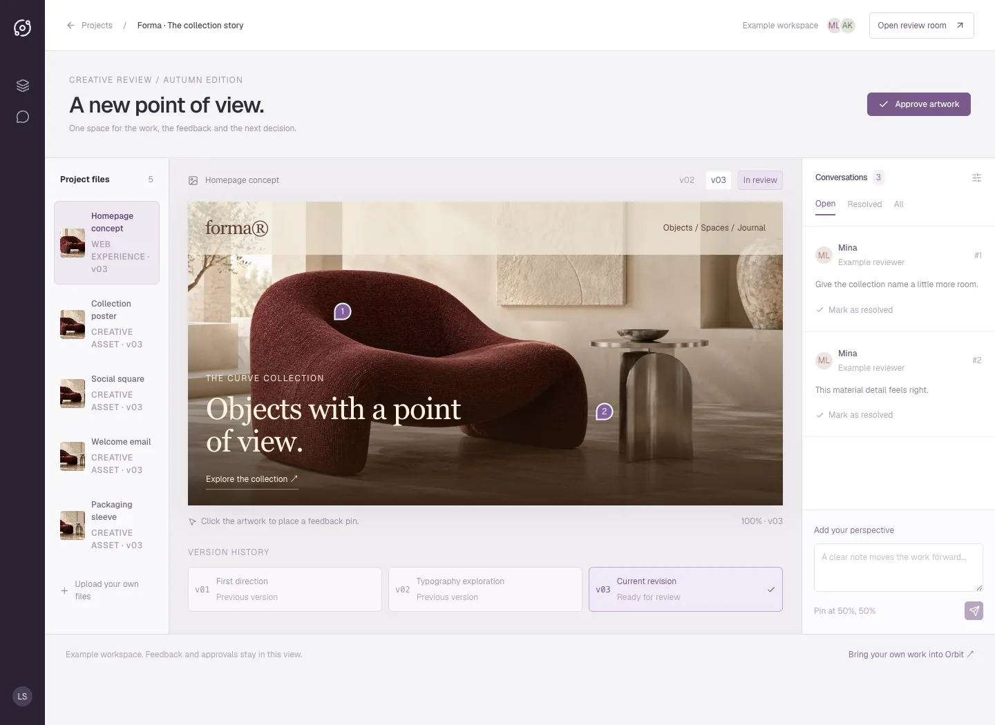
Orbit
A plum review room puts the artwork at the centre, with a project-file rail, version history, numbered pins and threaded feedback. The public interface is an interactive example of a full-stack creative-review app.
Explore the case study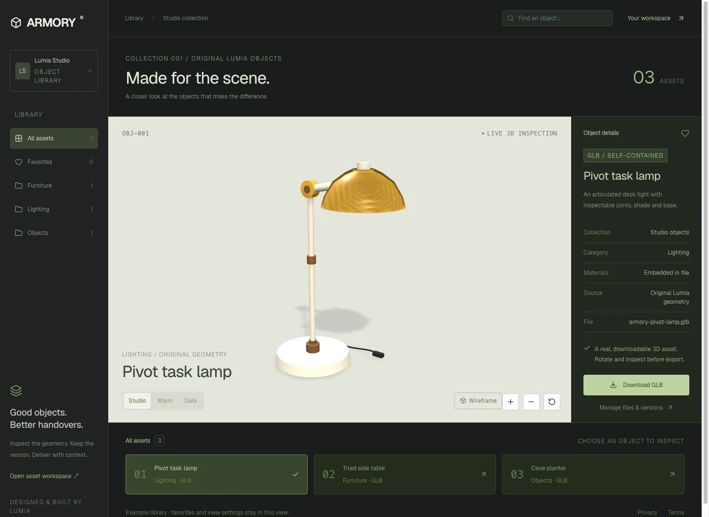
ARMORY
A mineral-green asset workbench pairs a large interactive 3D stage with an object inspector and collection shelf. Three original GLBs can be inspected and downloaded from the public interface.
Explore the case study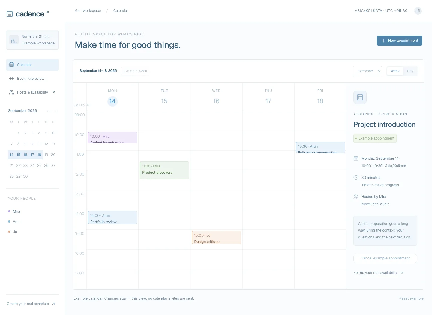
Cadence
A light blue calendar workspace brings the week, host filters and appointment details together. The interface preview supports local appointment creation and conflict checks, with a day view on small screens.
Explore the case study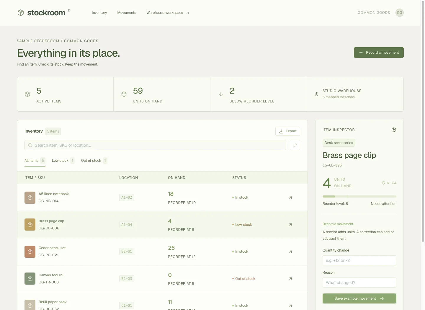
Stockroom
A practical inventory table, searchable SKUs, stock filters and an item inspector keep the day-to-day workflow in view. Example adjustments update quantities and preserve their reasons within the interface.
Explore the case study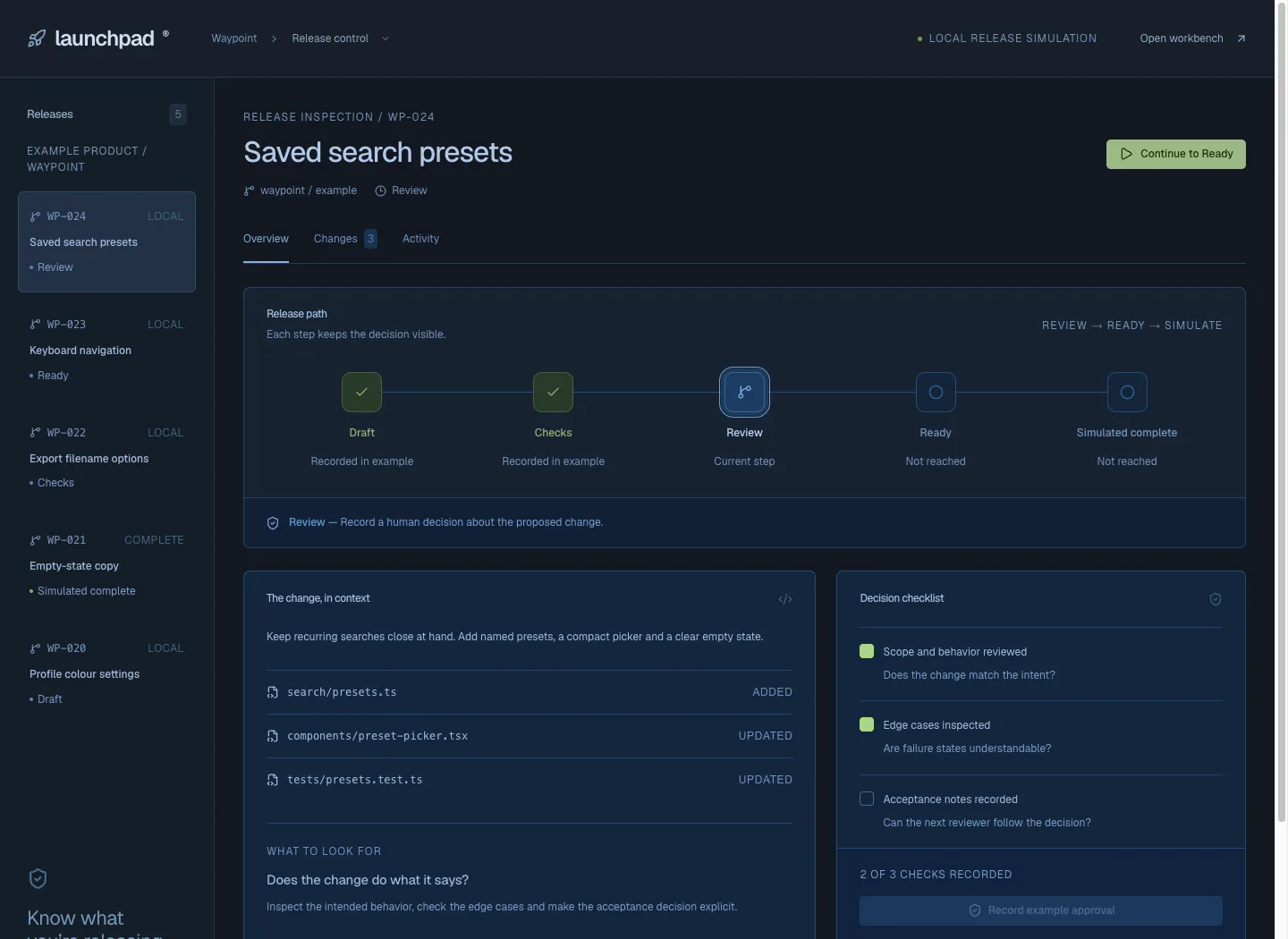
Launchpad
A dark release-control interface combines the release queue, staged path, changed-file story and decision checklist. Its public simulation makes review dependencies visible without implying a deployment occurred.
Explore the case studyImmersive websites
Five distinct experiences connect spatial exploration with a useful decision: inspect a product, shape a room, configure furniture, compare energy flows or plan a stay.
Nexus
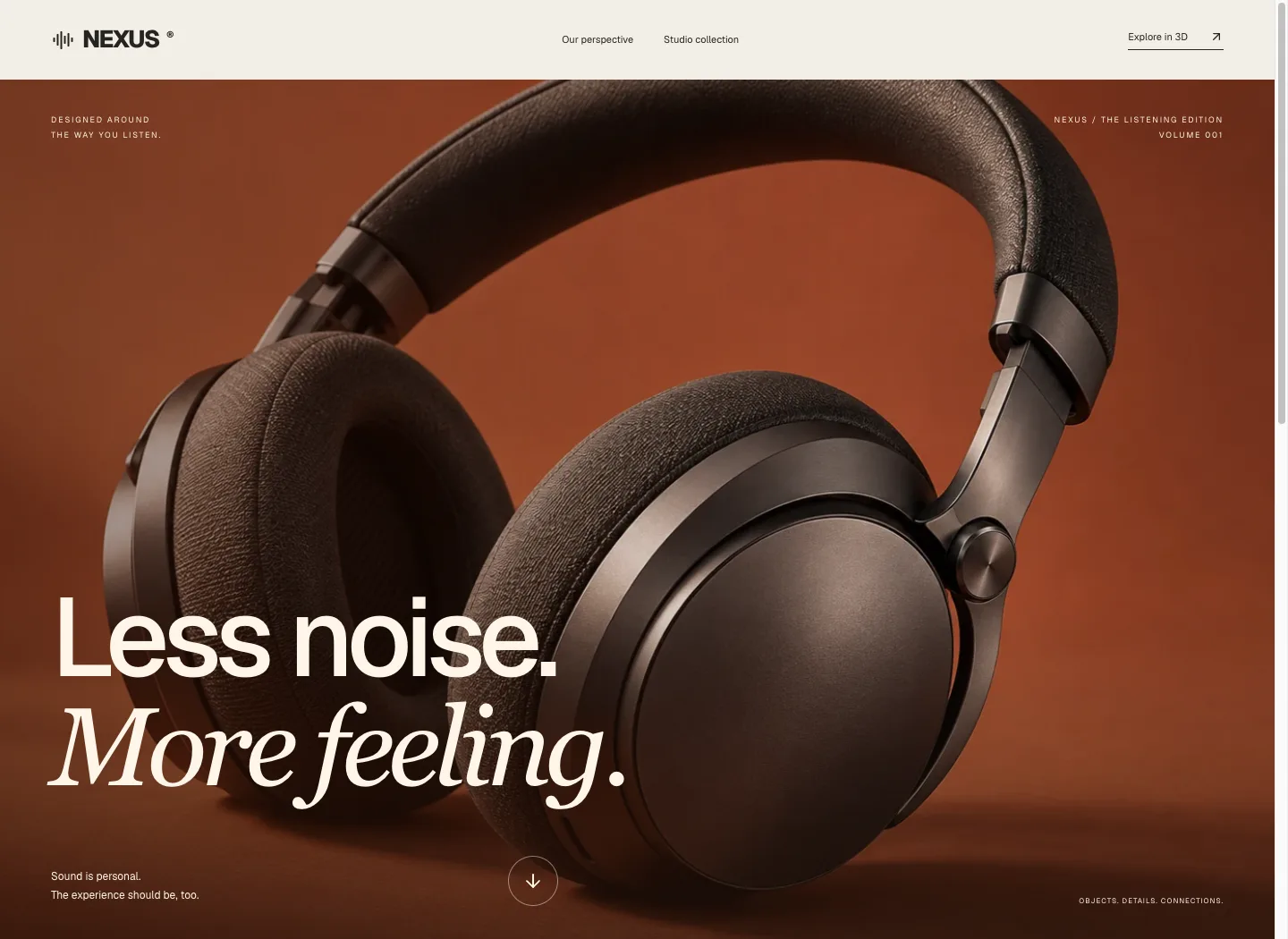
Terracotta product photography, expansive typography and a warm editorial rhythm introduce Nexus. A separate interactive studio collection lets visitors inspect the original interface geometry.
Explore the case study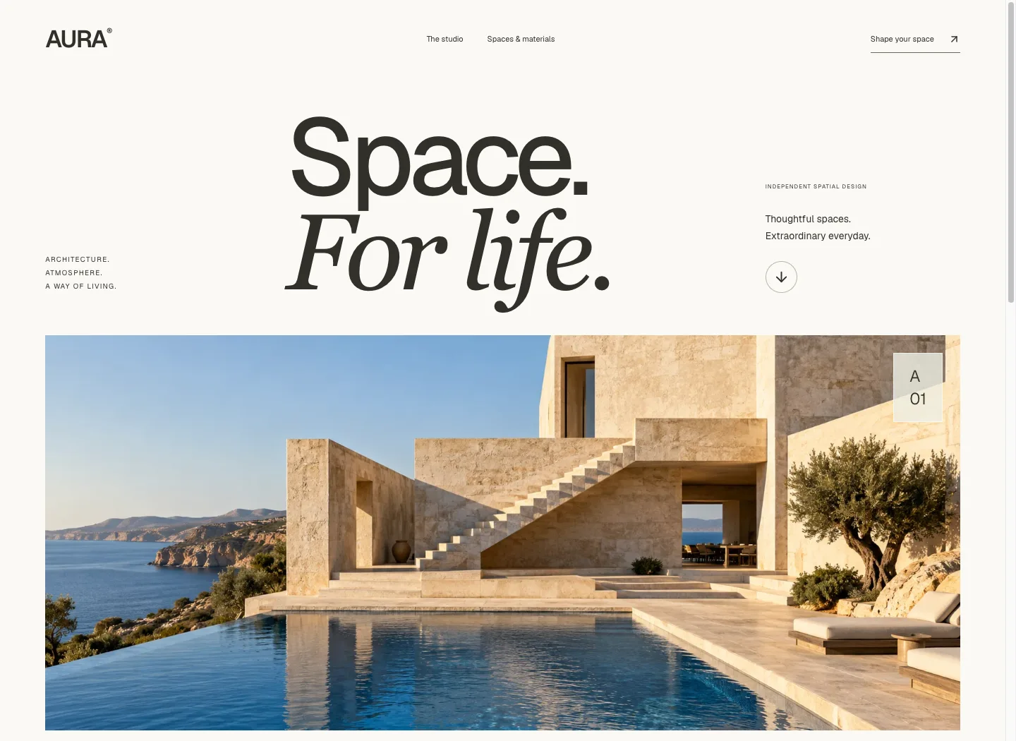
Aura
An oversized editorial masthead and cinematic coastal architecture lead into spatial thinking, interiors and material studies. The journey moves from atmosphere to a concrete room brief.
Explore the case study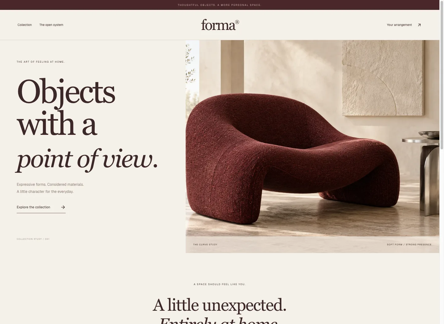
Forma
A boutique furniture collection pairs burgundy upholstery imagery with warm paper, serif typography and a quiet commerce rhythm. The open shelving system adds a real interactive finish and arrangement journey.
Explore the case study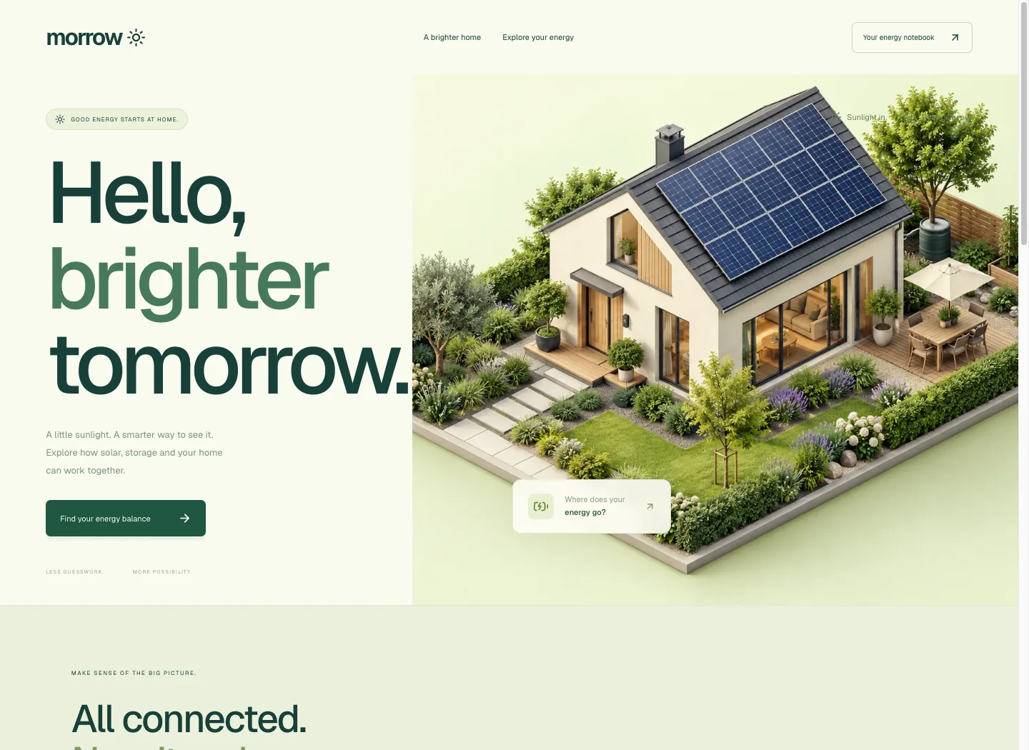
Morrow
A friendly green identity and a detailed miniature solar home introduce the energy story. The next section lets visitors change assumptions and follow the calculated flows.
Explore the case study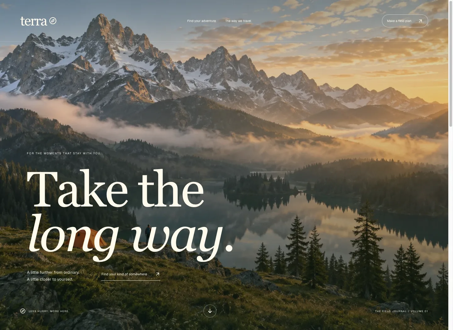
Terra
A cinematic alpine arrival, expressive serif typography and a selectable journey story turn the site into an outdoor editorial experience. The field guide preserves the practical planning path.
Explore the case study